The Royal College of Art in the late 1950s produced, in the space of a few years, a concentration of British artistic talent that has not been replicated before or since. Allen Jones, David Hockney, R.B. Kitaj, Patrick Caulfield — they were all there within a few years of each other, all engaging with similar questions about what painting could do when it took seriously the visual culture of advertising, film, and commercial illustration that Abstract Expressionism had tried to transcend. They would each find different answers. Jones's answer was the most charged and, in the end, the most misunderstood.
The Royal College Generation
British Pop Art was not American Pop Art transplanted. Where Warhol and Lichtenstein were engaging with mass production, the serial logic of consumer goods, and the removal of the artist's hand from the work, the British painters at the Royal College were doing something more explicitly personal — using the visual language of popular culture not to comment on it from a distance but to explore questions about desire, identity, and the complexity of the painted surface. Jones's relationship to commercial imagery was not ironic. He was genuinely interested in the formal qualities that made advertising images work, and he brought those qualities into his paintings without apologizing for what he found there.
The specific visual intelligence Jones developed in his paintings of the 1960s — the Matisse-like command of color as structure, the Lichtenstein-adjacent deployment of commercial art's graphic clarity, the figuration that was neither academic nor primitive but something precisely in between — was distinctive and genuinely difficult. These were not easy paintings to make or to understand. They required the viewer to hold several registers simultaneously: the formal qualities of color and line, the representational content, and the relationship between them that is where the actual meaning of the work lives.
"The color isn't decoration. It's structure. If you take the color out of these paintings, you don't have paintings anymore — you have something else entirely."
— Allen JonesThe Furniture Problem
In 1969, Jones made three sculptures — Table, Chair, and Hatstand — that used life-sized female mannequins as functional furniture bases. They were exhibited and became immediately controversial, criticized as objectifying and degrading to women. The feminist critique was made forcefully and continues to be made. The question of whether that critique is the definitive response to the work, or whether the work contains something that cannot be reduced to what the critique addresses, is not one that has been settled.
What is certain is that the furniture sculptures have functioned as a kind of critical filter, through which Jones's entire practice has been subsequently viewed. Reviewers of his paintings in the decades since 1969 have often felt obliged to address the sculptures before they could address the paintings, and this obligation has had the effect of making the paintings seem secondary or derivative of a controversy rather than primary works in their own right. This is a critical failure, not a failure of the work.
The paintings from the 1960s and the printmaking from the 1970s onward exist independently of the furniture controversy and should be evaluated independently of it. The question of whether a set of sculptures from 1969 were misguided or offensive does not determine whether a painting from 1965 or a lithograph from 1981 is formally successful. These are separate questions, and the conflation of them has damaged the public understanding of what Jones actually achieved as a painter and printmaker over a sixty-year career.
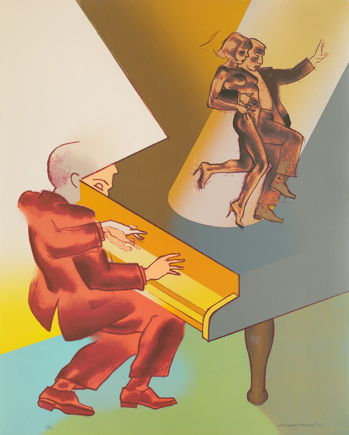
Allen Jones, Come Dancing, from Sheet Music, 2003. Screenprint in colours on wove paper. 41 × 32⅞ in. (104.2 × 83.6 cm).
What the Prints Show
The printmaking practice — lithographs, screenprints, etchings — is where Jones's finest work often lives, and where his formal intelligence is most clearly visible without the distraction of the figurative subject matter. The print is a medium that rewards exactly the qualities Jones has in abundance: a command of color that understands how one hue inflects another in optical proximity, a graphic clarity that knows how much information a line can carry before it becomes confused, and a compositional sense that organizes complex elements into a legible whole without losing their individual vitality.
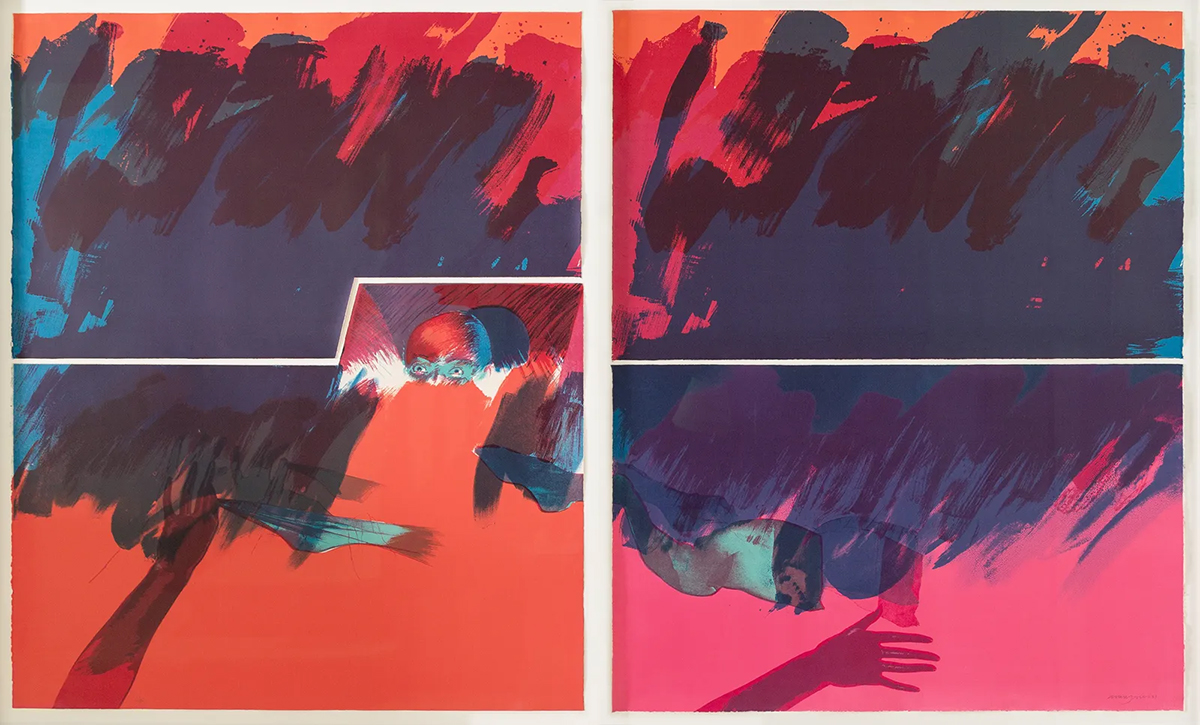
Impromptu (1981), the four-sheet lithograph presented here as two framed panels, demonstrates what Jones can do when the formal demands of the print medium are allowed to drive the composition. The color relationships are bold without being violent, the figuration is present but not insistent, and the overall surface has a quality of resolved intelligence that is the hallmark of a printmaker who has spent decades understanding what the medium can and cannot do.
The screenprints from the Sheet Music series (2003) show the same qualities in a different register: brighter, more declarative, closer to the vernacular of popular culture from which Jones has always drawn. They are not less serious for this closeness. They are more serious, because they demonstrate that the graphic intelligence Jones developed over sixty years can accommodate almost any formal challenge without losing its essential character. The argument about Allen Jones will continue. The work will accommodate the argument without being determined by it.