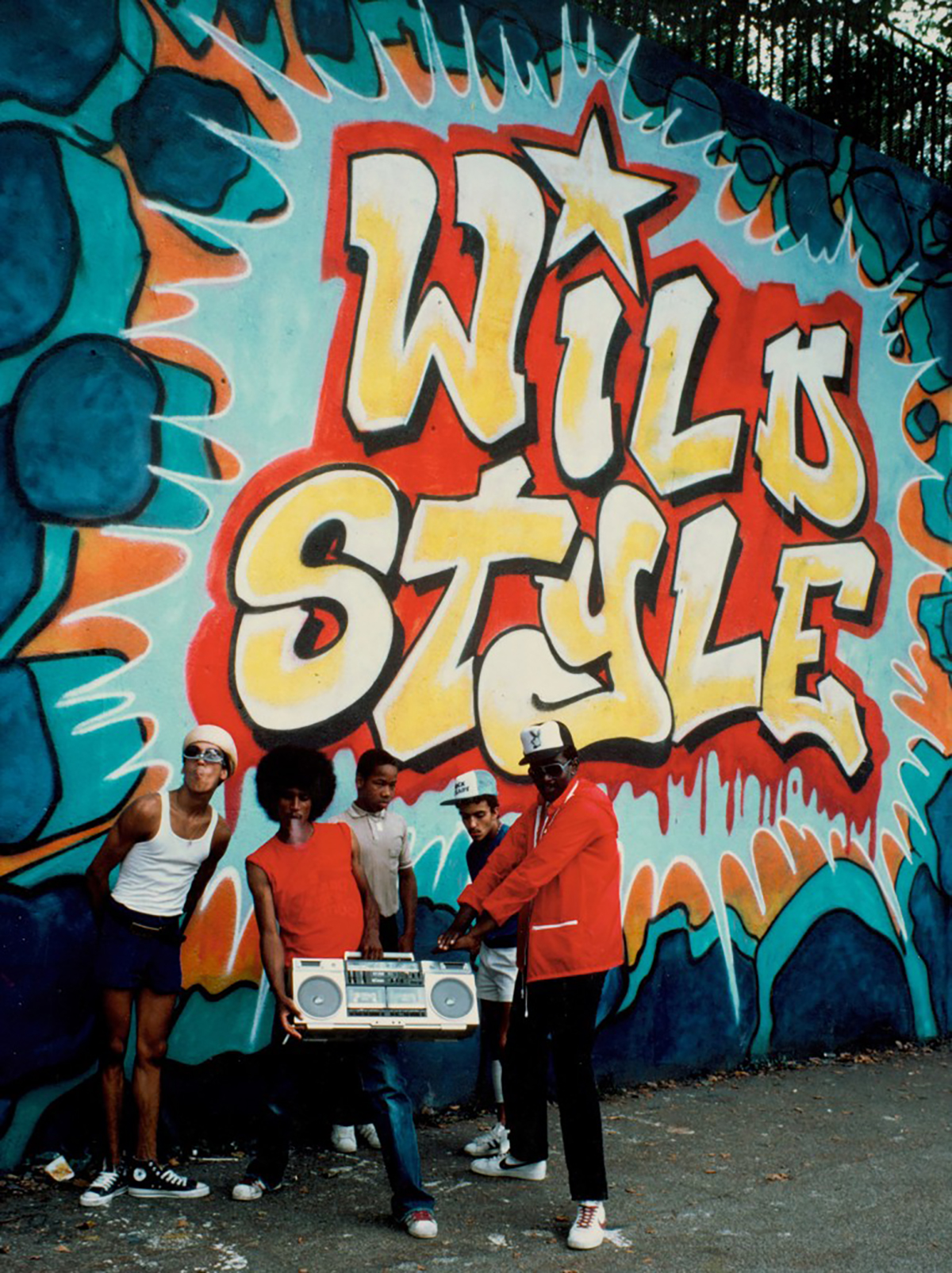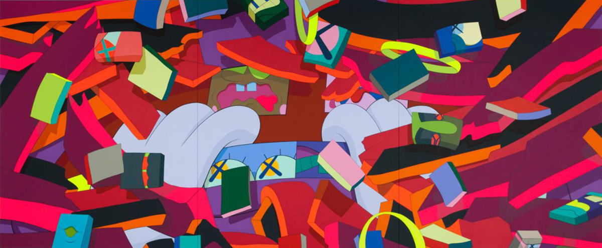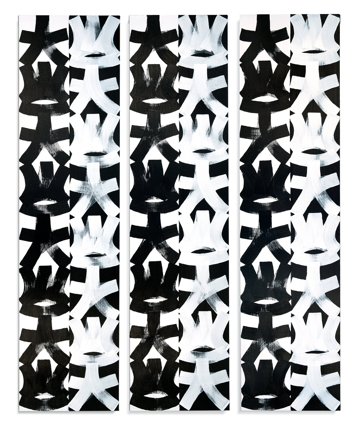
Before Eric Haze became the designer whose identity work defined the visual language of early hip-hop, he was a writer in the purist sense: someone obsessed with the form of the letter, the way a character could be constructed from a sequence of marks, the relationship between speed and legibility and style. This obsession with letterform is what the graffiti world understood him to be doing, and it was right. But the obsession was never really about letters. It was about the mark itself — the single act of a tool against a surface — and the letter was simply the most demanding training ground available for learning what marks can do.
The Letter as Architecture
Graffiti's typographic tradition is, from a formal standpoint, one of the most demanding in the history of lettering. The constraints of spray paint — its tendency to drip, its limited precision at speed, its resistance to correction — demand that the writer develop extraordinary control before achieving the kind of fluid complexity that the best pieces display. The letter in graffiti is not a given: it has to be constructed, stroke by stroke, with an understanding of how each mark will interact with the ones before and after it.
Haze excelled at this construction. His letterforms were notable for their precision — the quality of the line, the consistency of the weight, the spatial intelligence of the letterfit. These are qualities that translate directly into graphic design, and when Haze began working in that mode in the early 1980s, he brought his writer's sensibility with him: every letterform a decision, every space between letters a relationship, every composition an argument about how elements should coexist in a bounded field.
The identity work he did for hip-hop's first generation of artists — the Beastie Boys, LL Cool J, Public Enemy — carries this sensibility in every element. These are not incidental designs. They are fully considered typographic architectures, built with the same attention to weight and space and proportion that the best graffiti pieces display. Looking at them now, what's striking is how completely they established a visual language that has been imitated and extended for four decades without being improved upon.
"Everything I know about painting I learned from trying to make a letter that was exactly itself. The abstraction was already there in every serif, every curve."
— Eric HazeWhat Design Taught the Canvas
The relationship between commercial graphic design and fine art practice is usually described as a tension — the designer who wants to make art, the artist who takes commercial commissions, the question of which mode is primary. In Haze's case this framing doesn't quite work. The design work and the painting practice are not in tension. They come from the same root investigation into what marks mean and how they cohere, and each has informed and refined the other over the course of a forty-year career.
What design taught the canvas — or more precisely, what designing for reproduction taught the making of unique objects — is the value of clarity. When you design a logo or a record sleeve, you are working with the knowledge that the image will be reproduced thousands of times, at different scales, in different contexts. This demands a certain kind of decision-making: you cannot rely on the accidental quality of a unique object because that quality will be lost in reproduction. Every element has to earn its presence by being the right element, in the right place, at the right weight.
Haze brought this discipline to his paintings, which are consequently much more resolved than their surface spontaneity suggests. The gestural marks in his canvases are not improvised in the pejorative sense — they are arrived at through a sustained practice of decision-making that has been refined by years of commercial work where every decision has to be defensible in terms of visual logic. The paintings look free. They are, in fact, the product of rigorous training in what freedom should look like.
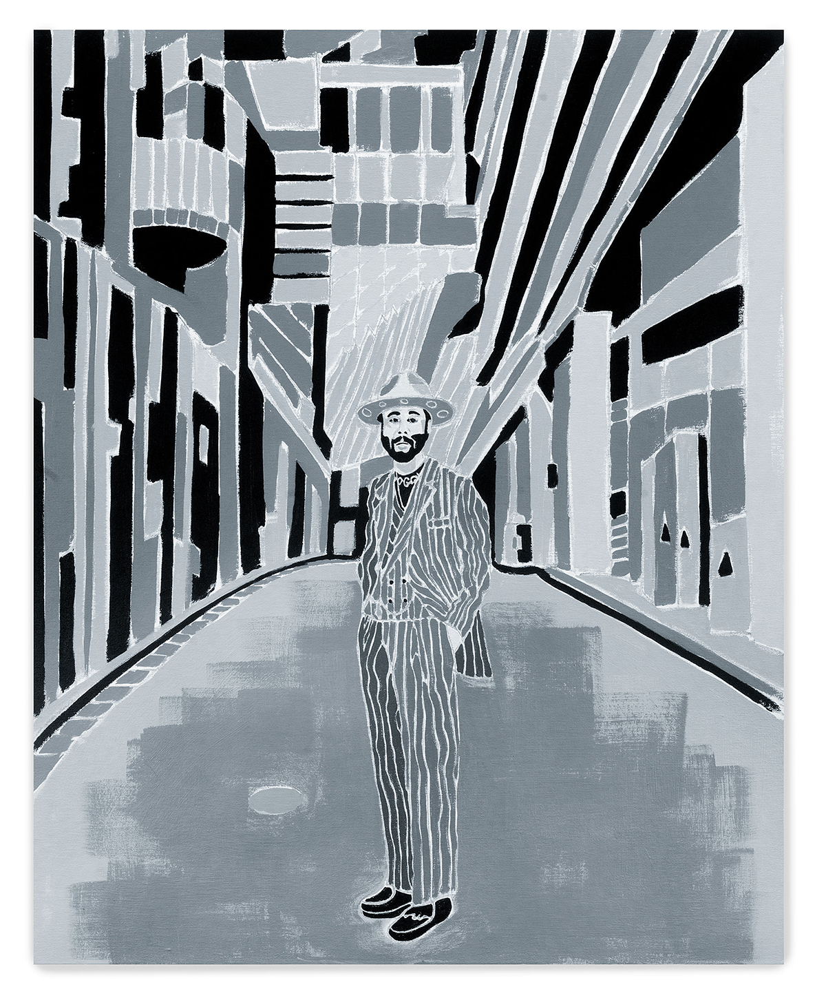
Haze, Untitled, 2022. Acrylic on canvas. 42 × 34 in.
Pure Color and Nothing Else
The abstract paintings Haze has made over the past three decades occupy a distinctive formal territory. Many of them work in the narrow vertical format — the 72 × 18 inch proportion of the 2017 untitled works, for instance — that has no obvious precedent in the graffiti tradition (subway cars are horizontal) or in the standard practice of abstract painting. This format choice is itself an act of resistance: it resists the conventional landscape orientation, resists the square that so much post-Minimalist painting has used, and resists the portrait orientation that aligns a painting with the standing human figure.
Within this narrow field, Haze makes color decisions that are immediate and unequivocal. The acrylic is applied directly, without underpainting in the conventional sense, and the gestures that organize the surface — vertical strokes, horizontal bands, occasional diagonal incursions — have the character of something arrived at rather than planned. The colors are not mixed toward subtlety. They are placed in direct adjacency and allowed to create their own relationships, which are sometimes harmonious and sometimes deliberately abrasive.
What you are looking at when you look at a Haze painting is the record of someone who spent thirty years learning how to reduce visual decision-making to its irreducible minimum and then spent another thirty making work from that minimum. The abstraction is not arrived at through the removal of representation — there was never anything figurative to remove. It is native to the practice, present from the beginning in every careful letter that turned, through sustained attention, into a mark that didn't need to be a letter at all.